


Most of the plots in this book were generated from the responses to a series of surveys I conducted using Amazon’s Mechanical Turk service (“MTurk”) between 2016 and 2022. This Appendix describes how I processed the data to generate the plots. 1
But first, a word on the demography of MTurk workers. They represent a fairly broad cross-section of Americans. They’re certainly more varied and representative than the respondents that used to make up the mainstay of academic surveys in the social sciences: undergraduates on college campuses. However, there are some significant statistical differences between MTurk workers as a population and the US as a whole. The biggest are age and sex.
To create an account, you have to be at least 18 years old, so children aren’t represented at all. It would be interesting to know how the under-18 crowd would respond to some of the questions, but this would require different tools (and a careful ethics review). People over 50 are also underrepresented, while younger adults are overrepresented. Few respondents are over 70, and almost nobody is over 80—much like a typical young professional workforce.
The age and race distributions of MTurk workers are quite stable over time. Separately plotting age distributions for the 2018, 2019, 2020, and 2021 surveys on gender and sexuality (which are, remember, distinct sets of respondents) shows that, except for random noise due to limited sample size, the curves are all the same. This gives us a rare instance of a variable that changes purely as a function of age, and not as a function of time (see Chapter 7), unlike any of the personal identity or behavioral traits explored throughout this book. Not coincidentally, unlike those traits, age isn’t subject to social transmission. But more to the point, the stable age distribution tells us that people at every age are entering and leaving the Mechanical Turk workforce, “mixing” with the larger population in a way that leaves this key demographic property unaffected. Hence, year-to-year changes in other traits can be fairly confidently attributed to real changes in the US population, as opposed to unrelated changes in the demographics of Mechanical Turk workers.
As described in Chapter 5, women’s longer lifespan affects the sex balance in the US; at 18 years old, they’re a slight minority, while by age 75 they represent 55% of the population, and rising. Among survey respondents, women are a significant majority across almost all ages. Women may be the majority because, although Mechanical Turk is a bit like Uber, you can take online surveys without needing to leave home, own a car, or let strangers into your space. So at least physically, it’s a safe way to participate in the gig economy. It also requires no resources other than access to the internet, and is compatible with being a homemaker. Hence Uber workers skew male, and Mechanical Turk workers skew female, especially among the older respondents—arguably, further evidence of male privilege.
Many of the plots in this book break down respondents by age, which (mostly 2 ) sidesteps the differences in representation by age; there are just larger error bars where there’s less MTurk representation. Plots that break down respondents by (binary) sex similarly sidestep any non-representative sampling by sex.
You may have noticed something different about the age histograms in this Appendix: they’re unbinned, or more accurately, the bins are all a single year, 3 unlike similar plots throughout the rest of the book where I’ve binned age ranges more coarsely to produce a smoother curve. Unbinned, the data are noisy, even when including the whole population of respondents. Above age 80, there are so few respondents that some data points are entirely missing.
A degree of judgment is needed to interpret noisy histograms. Is the apparent rise in female respondents after middle age real? Almost certainly. Are the drops below 50% at some ages above 70 real? Probably not, but the response counts are too low to say so with high confidence. There’s no unbiased, optimal, and “fully automatic” way to make such judgments. I tried several fancy ideas from the statistics literature, but they introduce problems of their own. 4 Almost all have one or more parameters, making them not “fully automatic.” Some generate output with discrete steps, creating the illusion that the underlying percentages change discontinuously at precise ages. Others generate smooth curves, but these curves still have up-and-down wiggles that aren’t statistically significant—yet judging the significance of those wiggles becomes less intuitive when the data have already been heavily processed. Getting rid of the wiggles is possible, but only at the cost of washing out a lot of interesting and statistically meaningful variation by age.
At the heart of the problem is the tradeoff between bin size and sample size. A small bin (in the limit, a single year) will let us finely resolve changes in percentage by age, but then the sample size within each bin will be low, making the percentage itself highly uncertain. A large bin will include more samples, hence improve our estimate of the percentage, but at the cost of washing out any changes by age.
Remember that each sample is just one bit of information, a yes/no, or in the language of statistics, a “binomial variable.” If a bin has no samples in it, our uncertainty is complete. If it has a single sample, then the only possible values are 0% and 100%. If it has two samples, the only possible values are 0%, 50%, and 100%. As the number of samples grows, the number of possible values increases, and our confidence in the accuracy of the measured value increases too—that is, the error bar gets smaller. Quantifying this relationship relies on making some statistical approximations, which I’ll only sketch here. Consult the sources I cite for derivations and more details.
If $$n^+$$ is the number of “yes” responses and $$n^-$$ is the number of “no” responses, for a total of $$n={n^+}+{n^-}$$ samples, then the probability of a “yes” is easily calculated: $$p={n^+}/{n}$$. We can express it as a percentage by multiplying by 100.
But what about the error bars? Often, error bars are described as “plus or minus” some fixed measurement error $$\varepsilon$$, which we’d write $$p\pm\varepsilon$$, but this can’t work here, as any probability $$p$$ must remain between zero and one. So, for instance, if we had a sample size of three and all three responses were “no,” then we’d have $$p = 0$$, but with such a small sample the uncertainty should be high; yet zero would still have to be the lower bound on the confidence interval, because a probability can’t be less than zero. Hence the error bars can’t be symmetric. Put another way, the midpoint of the confidence interval can’t in general be $$p$$.
American mathematician Edwin Bidwell Wilson (1879–1964) derived an elegant, often-used formula for the asymmetric error bars of a binomial variable. 5 In a 2006 paper, biostatisticians Jake Olivier and Warren May 6 give the following modified form of this “Wilson interval”:
where
and $$Z_{\alpha/2}$$ is the “probit” (or $$1-{\tfrac{1}{2}}\alpha$$ quantile of the normal distribution) corresponding to the target error rate $$\alpha$$. Throughout the book, I’ve used a 90% confidence interval, which works out to
with $$\alpha = 1 − 0.9 = 0.1$$.
Olivier and May’s form of the Wilson interval is useful in a couple of ways. First, it shows that the midpoint of the confidence interval interpolates between $$0.5$$ and $$p$$ with coefficient $$w$$. If $$n = 0$$, $$w = 1$$, the midpoint is $$0.5$$, and the confidence interval ranges from zero to one, indicating complete uncertainty as one would expect. As $$n$$ increases, $$w$$ goes toward zero, the midpoint gets closer to $$p$$, and the uncertainty shrinks. Practically, the formulation allows us to use weighted averaging to calculate $$p$$. 7 I’ll get to how survey respondents are weighted in a moment.
First, though, let’s finish with binning. One option would have been to do something dead simple: use a fixed bin size—say, 6 years—for all plots. However, there is no single optimal bin size. Using a single value produces huge error bars and poor estimates in some places, while washing out important and statistically significant detail in others. Rather than using either fixed bins or fancy but still imperfect automatic binning techniques, I’ve chosen the bins manually for each plot, sizing them adaptively to bring out finer detail where the data support doing so, and using larger bins to get rid of fluctuations I judged likely to be spurious. I tried to err on the side of larger bins to keep the plots as legible as possible and avoid adding visual noise to them. As often as possible, I’ve also combined multiple series in the same plot (hence with the same binning), to allow for apples-to-apples comparisons. I believe the result is a reasonable balance between clear storytelling, simplicity, and statistical rigor.
Avoiding fancy techniques and showing the binning clearly on the plots also allows one to read off data points, like “about 20% of 18–20 year-old female respondents are lesbian” (see Chapter 8), with confidence that this statistic is accurate, easily reproducible, and “what it says on the tin,” that is, based solely on the weighted responses of all 18–20-year-old female respondents. However, the exact percentage, the shape of the curve, and the error bars will all change if the youngest age bin is instead set to 18–19, or 18–21. That’s why, in the freely available online version of this book, the binning is editable. If you tap on the button, you can drag bin boundaries to move them, and add or remove bins by tapping. You can also download the unbinned data behind each plot, allowing for a more open-ended re-analysis. 8
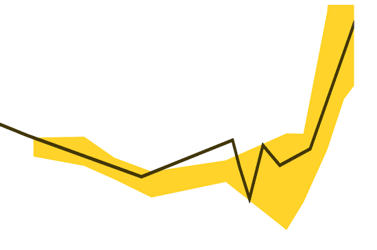
To illustrate visually how varying the binning can affect the curves, we can try superimposing many randomly binned versions of the same data—here, as an example, responses to the question “Do you identify as non-binary?” as a function of age, per figures 10.1 and 10.2 in Chapter 10. (Averages are rendered in semi-transparent black, while error bars are rendered in yellow; the binning used in figure 10.2 is also shown superimposed.) These many superimpositions make a good case that the U shape is real, and not an artifact of any specific choice of bins. Still, the exact profile of the U can vary substantially depending on binning, and some bin choices introduce additional artifacts. 9 In the plots throughout the book, I’ve tried to bin conservatively, to reveal the stable underlying pattern while keeping the counts in each bin as large as possible.

I’ve used a technique commonly called “stratified sampling” to non-uniformly weight the answers of different respondents. The concept is straightforward. Suppose we’re estimating the number of people who answer “yes” to a question like “Are you heterosexual?” between the ages of 50 and 70. To use round numbers, suppose that 52% of Americans in that age range are women, but 65% of survey respondents in the same age range are women. (For purposes of this calculation let’s also assume a sex binary, i.e. that 48% of Americans in this age range are men, and 35% of our survey respondents are.) Since women and men vary systematically in how they respond to the question, we’d want to weight our survey respondents’ answers in such a way that the average will reflect the US population as a whole. Specifically, the mens’ answers should be overweighted by the ratio $$0.48/0.35 \approx 1.37$$ while the womens’ answers should be underweighted by $$0.52/0.65 = 0.8$$. I’ve done this kind of reweighting based not only on sex, but on a handful of crude demographic characteristics measured by the 2017 US Census:
Age, broken down into four ranges: 18−24, 25−34, 35−49, and 50+.
Sex, binary and based on assignment at birth.
Race, broken down into four categories: White or “Caucasian,” Black, Asian, and all others, this last including Native American, Asian and Pacific Islander, and any non-categorized response.
Urban vs. rural, based on population density calculated from ZIP code.
This works out to $$4 \times 2 \times 4 \times 2 = 64$$ demographic buckets in total. It’s important to emphasize that these categories are arbitrary and should not be interpreted as meaningful in their own right. As many plots in this book make clear, there’s nothing special about any particular choice of age ranges, and neither sex nor urban/rural distinctions are binary in real life. The four racial categories, too, are not only arbitrary, but poorly defined and reductive, not unlike those used in South Africa under Apartheid. I’ve broken the data down into these 64 buckets for reweighting because when one uses stratified sampling, it’s important to keep the total number of categories for reweighting small, and the occupancy of each category non-negligible, lest one end up with overly large weights for small or undersampled populations (which would produce a noisy result). The 2017 US Census provided fairly reliable estimates of the total sizes of these particular buckets, and our MTurk survey respondents could also be sorted into them based on their answers to specific questions (some of which, e.g. for race, mirrored the anachronistic language used in the Census precisely to make a direct comparison possible). Regardless of how arbitrary the buckets are, when populations are sorted in this way, their answers to other survey questions do vary systematically by bucket, and re-weighting the buckets to conform to the overall US population is likely to make our statistics more representative. 10
In Chapter 1, I mentioned that there were a few “traps” laid in the surveys to exclude from the analysis most people who responded by clicking randomly. These included:
Checking six questions about birth month: “Were you born in January or February?”, “Were you born in March or April?”, “Were you born in May or June?”, “Were you born in July or August?”, “Were you born in September or October?”, and “Were you born in November or December?” Exactly one of these six questions should be answered with a “yes,” and the other five with a “no.” Since there are $$2^6=64$$ possible responses, clicking at random will yield a valid combination only $$6/64=9.375%$$ of the time. 11 Recall also that the questions are interspersed with many others in random order.
In addition to asking for the respondent’s age, some surveys asked the yes/no question “Were you born before 1983?” I picked this year because it divided respondents fairly evenly in half based on their median age (at least, at the time I wrote the question). Random clicking will thus be inconsistent with age about half the time. 12
Answering the same way to both “Were you born in the US?” and “Were you born outside the US?” is inconsistent, and will happen 50% of the time for a random clicker.
Answering “yes” to “Do you menstruate?” but “no” to “Have you ever menstruated?” is inconsistent, and will happen 25% of the time for a random clicker.
Answering “no” to “Have you ever been pregnant?” but claiming to have personally given birth to more than zero children is inconsistent.
Age, number of children, height, and weight (when present) are checked against generous upper and/or lower bounds. 13
In the politics surveys, voting for multiple presidential candidates in the same November election is disallowed, as is claiming to have voted for a 2016 candidate while answering “no” to “Did you vote in the November 2016 presidential election?”, or claiming to be planning to vote for a 2020 candidate while answering “no” to “Do you plan to vote in the November 2020 presidential election?”
ZIP codes are verified.
In general, around 10–20% of respondents were weeded out by these “traps,” though the majority appear to have been honest mistakes or misunderstandings rather than random clicking. Not being weeded out doesn’t guarantee honesty, but it means that a respondent would have needed to go to some effort to invent a consistent fake persona.
In Chapters 2 and 14, linear methods are used to combine the responses of multiple yes/no questions into numerical scores—in Chapter 2, $$D=30$$ questions about handedness, and in Chapter 14, $$D=37$$ questions about gender presentation. Responses are modeled as $$D$$-dimensional vectors of zeros (for “no”) and ones (for “yes”). The overall average response is first calculated and subtracted from each individual response, so that response vectors are zero-centered. Each component is then normalized by its standard deviation. Zero-centered and normalized response vectors are used for linear regression and, in Chapter 14, Principal Component Analysis (PCA). Errorbars for linear regression are calculated empirically, by holding out a random 30% of the responses to serve as the test set, while evaluating optimal question weights using the remaining 70% of the data. This process is repeated 600 times. Histograms of linear estimator performance show average values and 90% confidence intervals for the held-out test data over these 600 runs.
A final note. In plots showing the medians of nonnegative integers, such as number of children (e.g. in Chapter 18), uniform random values in the range $$\left(-{\tfrac{1}{2}}, +{\tfrac{1}{2}}\right)$$ are added to individual samples, then these are clipped to avoid going negative, before calculating medians and quantiles. This is done to allow the medians and quantiles to vary continuously, revealing underlying trends in the data rather than stair-stepping between integer values. (Means, drawn as solid lines, are calculated using the raw data without any added noise.) The method isn’t perfect, but it’s simple, it makes the plot more informative, and it produces unbiased quantile estimates.
When other datasets were used (e.g. for long term and international statistics like human population over the last 10,000 years), you can find a pointer to the original source under the plot’s ↓ button in the online version of this book.
One might still worry about the differing distribution shapes within an age bin, especially if the age bin is broad; in practice, however, this isn’t a major effect.
The questions about birth month actually allow somewhat better age precision.
Shimazaki and Shinomoto, “Kernel Bandwidth Optimization in Spike Rate Estimation,” 2010; Jensen, “Kernel Probability Estimation for Binomial and Multinomial Data,” 2015; Scargle, “Studies in Astronomical Time Series Analysis. V. Bayesian Blocks, a New Method to Analyze Structure in Photon Counting Data,” 1998.
Wilson, “Probable Inference, the Law of Succession, and Statistical Inference,” 1927.
Olivier and May, “Weighted Confidence Interval Construction for Binomial Parameters,” 2006.
One could take this further and calculate a correction to w based on the variation in sample weights contributing to each estimate; when the stratified sampling weights vary widely, n is effectively reduced.
I’m not making raw survey data available, as this would require very careful vetting to avoid any possibility of de-anonymization. Narayanan and Shmatikov, “Robust De-Anonymization of Large Sparse Datasets,” 2008.
You may wonder whether this superimposition technique could itself have been used to render “objective consensus” curves throughout the book. Unfortunately, even here there are “editorial” choices: each random binning is created by picking a constant number of bin boundaries (I’ve chosen 10), uniformly distributed over the range of ages (here, 18–76). These (or any other) choices, and the underlying non-uniformity of the data, mean that the distribution of different curves visualized is still not free of statistical bias.
I’ve also generated versions of all of the survey-based plots in this book using raw, unweighted data; in general, the results are not qualitatively different from the weighted ones, though of course precise percentages and curve shapes do vary. The downloadable data in the online version of this book provides stratified sampling weights independently, allowing data nerds to reproduce unweighted plots if desired.
In practice, considerably less often, as when humans “click at random” the result isn’t really random—it usually consists either of straight “no”s, straight “yes”es, or a more-balanced-than-truly-random mix of “no” and “yes.” In other words, confronted with six binary questions and told to answer them randomly, few people will answer five one way, and just one the other way, because the result doesn’t “look random enough.”
Birth month and the exact date the survey is taken both figure into the calculation.
Think: Guinness World Records.
These histograms are binned uniformly by 15 second increments.